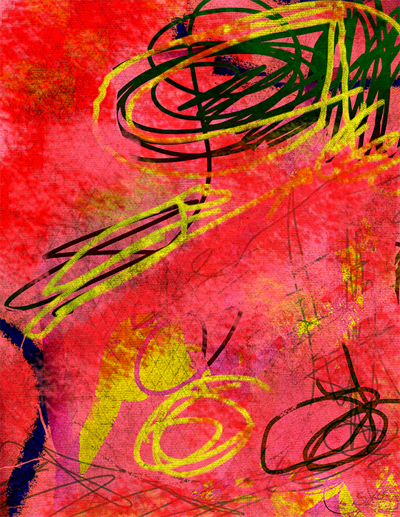
death by wallpaper
Posted by Wendy Skog on February 5, 2022
Imagine a world without color. It would be even worse than a world without coffee. A world without color would be like stepping through the screen of a black and white movie or tv screen. Imagine seeing the world in shades of gray with black and white at either end of the spectrum. It might be interesting at first but after a while , you would start thinking about that fire engine red poppy that just opened to your amazement, capturing your eye with the sheer force of its intense brilliance. This passage by DH Lawrence in Sons and Lovers would lose its visual vibrancy: "Over the gloomy sea the sky grew red. Quickly the fire spread among the clouds and scattered them. Crimson burned to orange, orange to dull gold, and in a golden glitter the sun came up, dribbling fierily over the waves in little splashes...." Color circumscribes the amity beneficial to the entire planet.
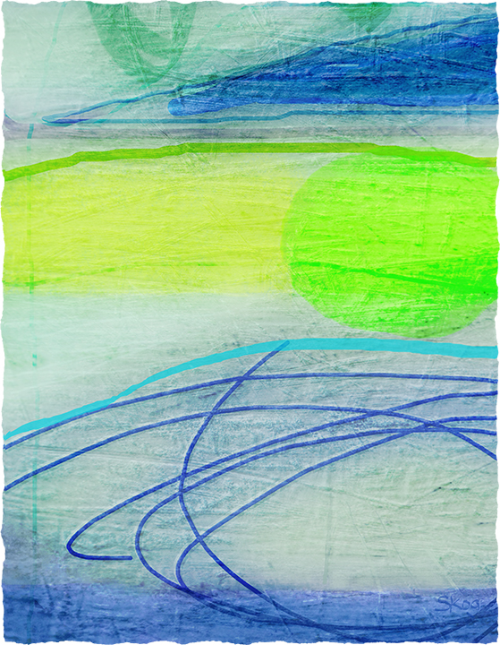
Loose Ends pigment ink on archival sugar cane paper
17 x 22 in. © W. Skog
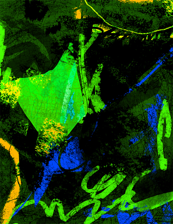
Paso Doble pigment ink on metal
16 x 20 in. © W. Skog
*Images are monitored by a copyright protection service.*
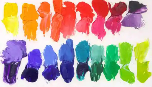
While some artists prefer to limit their spectrum of palette colors, I like to fool around with all the possibilities. I am attracted to the dark deep rich colors of wine, purple night-skies, the dull opaques of asphalt under streetlamps or west coast skies, the blacks of stovepipes and telephones , the warm orange-reds of a wood-fire, crisp cotton whiteness, the ochres of clay and paper bags, the rainbow profusion and purity of flower petals, velvety irises and flame red tulips, fire truck red and tomato red, the blueness of an Evening in Paris perfume bottle, the aquas of tropical shores and local swimming pools. I enjoy found, oval elliptical, soft female shapes and linear, structural, geometric, architectural hard shapes. I study the lines of thin willow branches and concrete crevices and cracks the way stone breaks. These are in themselves my subjects and light as well. Florescent, natural, incandescent, reflected and non-existent as in shadows
When I started painting, I used fine quality, heavily pigmented oils and applied them to latex - gessoed linen which has replaced more toxic lead grounds. Mixing a palette of color was a lengthy task involving the pungent aroma of the paint itself, turpentine and damar varnish. Sounds romantic doesn't it? But was it also toxic? Over time? Eventually I started thinking about safer ways to create art.
deadly wallpaper
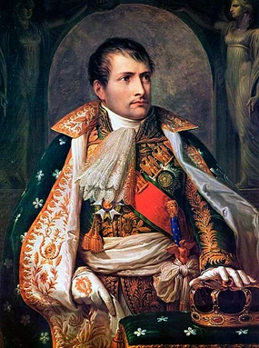
Scheele’s Green was an arsenic compound pigment used in the 1800's to dye everything from candles to sweets. This pigment was used as a dye for the ornate floral wallpaper patterns adorning the walls of Napoleon's Longwood House, his humid, tropical island home, where he reportedly soaked in long, luxurious baths. Napoleon’s stomach cancer could be attributed, at least in part, to this pigment because a type of mold can develop in moist environments containing this kind of pigmented wallpaper and releasing arsenic gas, which we now know is extremely carcinogenic. Indeed, in the 20th century, long after his death, toxicology tests were conducted on Napoleon’s hair. As you might have guessed by now, high levels of arsenic were found in his follicles. This pigment is now obsolete.
a strange love letter
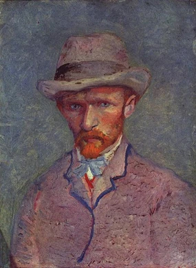
Why did Van Gogh slice off his ear? It had something to do with unrequited love perhaps but still his girlfriend would most definitely have preferred a nice bouquet of forget-me-nots to a severed ear in a large matchbox wrapped in a table napkin. His heavy impasto paint applications were composed of lead and he liked to lick his brushes. Van Gogh's madness along with his anemia, abdominal pain and seizures were all symptomatic of lead poisoning. Arsenic and lead are similar in that they are both heavy metals known to cause serious health problems.
Then there was chromium. In the early 1900's Frank Cyr wanted to make school buses bright shiny yellow. Unfortunately the pigment known as School Bus Chrome was a noxious hexavalent chromium essentially "hungry for electrons and will actually damage DNA trying to get it." Dating back to 79 AD in Italy, uranium was used for another yellow hue causing radiation poisoning. It was initially used to tint glass and ceramics but later for detailing military vehicles in WWW1 and WWW2 where women often rolled brushes between their lips to get a fine point. Red pigments have also been problematic deriving from cinnabar which can contain mercury when used in vermilion pigments. Cadmium in red pigments was linked to renal dysfunction, lung disease, lung cancer, and bone defects.
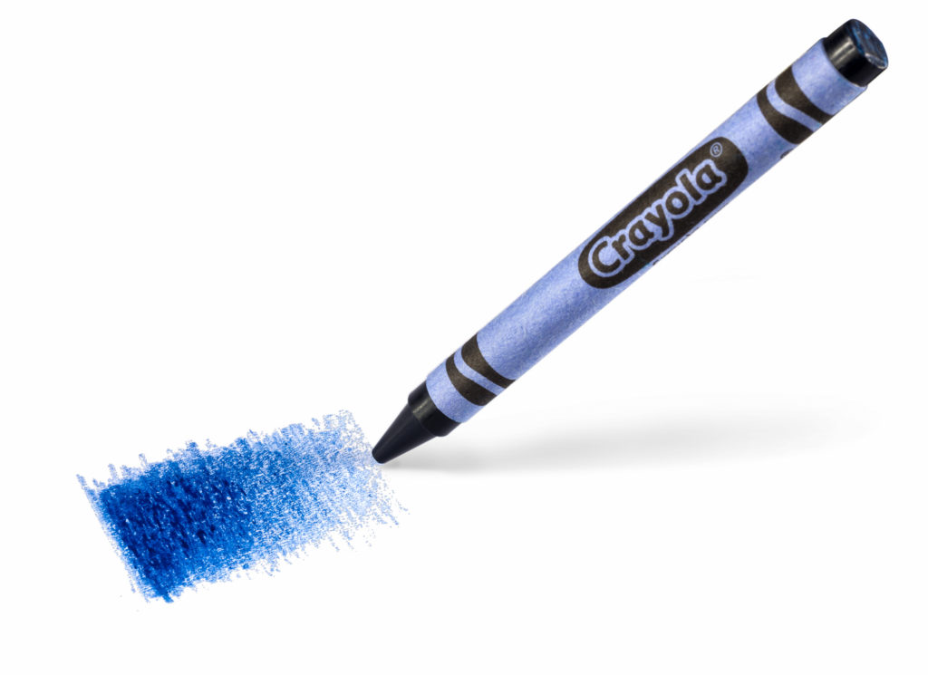
New pigments are being discovered. A new superblue Crayola crayon has entered the market. It was accidentally discovered while conducting experiments related to electronics by a chemist at Oregon State University in 2009 and is the first new blue pigment discovered in 200 years. It contains the elements Yttrium, Indium and Manganese so consequently was initially called YInMn blue until a child's contest winner named it Bluetiful. .
Today, thanks to the Labeling of Hazardous Art Materials Act of 1988, most of the heavy metal offenders in artists' paints have been phased out and replaced with hues of different pigments that are thought to be safer. Still, naphthol red that replaced cadmium as a safer alternative tests as a toxin in animals so there still may be other hazards despite the advances of biochemistry since Napoleon languished on a volcanic island.
One of my reasons for producing limited edition digital prints is the reduced toxicity compared to traditional printmaking which incorporates many deadly chemicals such as acetone, asphaltum, lacquer thinners, naptha, isopropyl alcohol, etc. and are hazardous to the environment as well as the artist. Apparently the ink you find in modern-day ink cartridges is mostly non-toxic, meaning it will not pose a health risk to humans if accidentally exposed to the liquid. The chemicals in ink for printers are said to be about as toxic as dish soap.
digital kaleidoscope
The prints on this website are personally hand-pulled in my studio using a pigment ink printer. The process is much less toxic which has great appeal for me and the environment. But of course I am not dealing with mixing mounds of physical paint material. Manually mixing color is a relatively mundane task; choosing color is the most important thing and not necessarily the easiest in the digital world which offers a choice of 16,777,216 colors as alphanumeric keys called Hex codes. The choices are easily as comprehensive as tube colors.
Red Pepper
pigment ink on archival sugar cane paper
17 x 22 in. ©W.Skog
copyright 2022 All rights reserved W. Skog Fine Art Print Originals